Napkin AI Review: It Got My Submit Flow Right, Then I Broke the Labels (4/5)
I pasted my own 108-word ToolifyNav submit flow into Napkin AI and got a flowchart with the right branches and retry loop in 8 seconds. Then a palette change turned my branch labels white on a transparent PNG, and every free export kept its "Made with Napkin" mark.
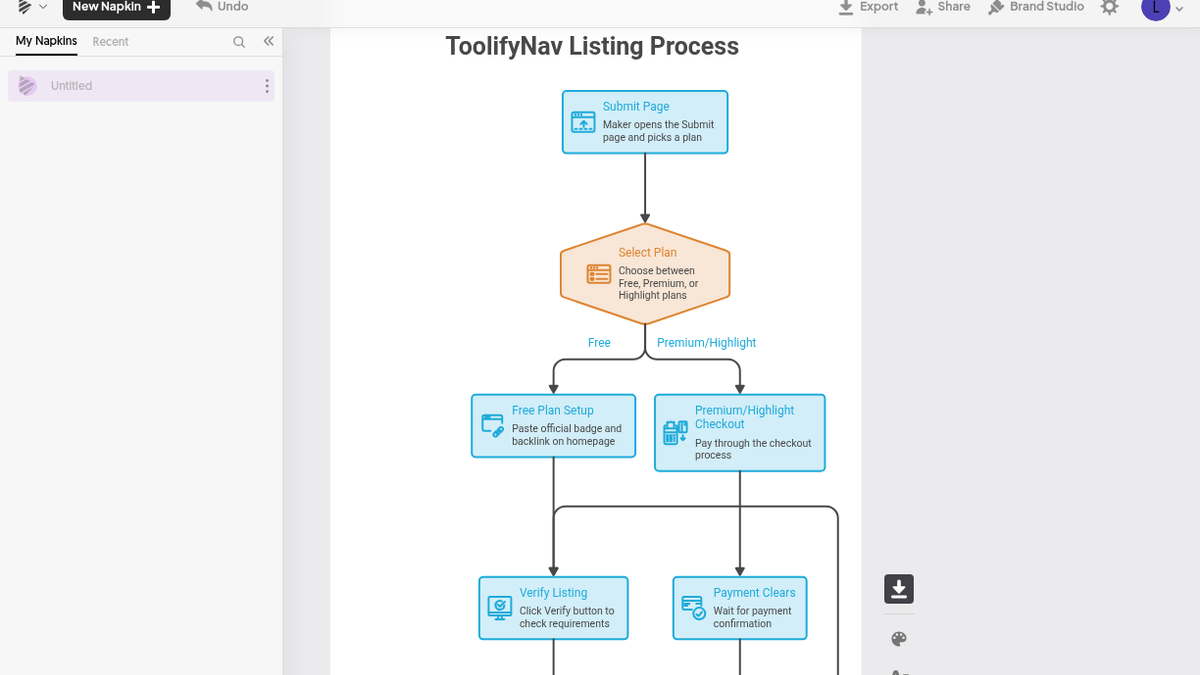
The 2x PNG looked fine on my screen until I dropped it onto a white page and noticed the arrows coming out of "Select Plan" had no words on them anymore. Same for the Yes and No under both decision hexagons. I put the file on a dark background to check, and there they were: "Free", "Premium/Highlight", "Yes", "No", all rendered in white on a transparent canvas. A palette change I'd made in the editor a few minutes earlier had quietly taken the connector labels with it.
That was the part I didn't see coming. I went in expecting to argue with the AI about logic and fix the diagram by hand. The logic turned out to be the easy bit.
Eight seconds for a paragraph I keep retyping

I explain ToolifyNav's submit flow constantly, to makers in email and in X replies, and it's always a wall of text. So the test input was my own 108-word paragraph: open the Submit page, pick a plan; on Free, paste the official badge and a backlink on your homepage and click Verify; if it's found you go live, if not you get an email saying what's missing and can try again; Premium or Highlight pays through checkout and goes live when payment clears; every Monday a scan rechecks Free listings and takes down anyone who removed the badge, with a badge-missing email.
Signup on napkin.ai was a plain email and password form, no SSO. I submitted at 22:12 and the "Your one-time verification code" mail from contact@napkin.ai showed up about 15 seconds later, in Outlook's Junk folder, not the inbox. Code in at 22:16, then a five-question survey (For work, Just me, Engineering, Blogs and newsletters, how did you hear about us), then "Thanks Leo! You're all set to create your first Napkin!" No card at any point.
A new napkin offers "By pasting my text", "By describing my idea" or "By importing a file". I pasted, clicked the small blue spark next to the paragraph at 22:19:48, and the AI Suggestions panel had six thumbnails at 22:19:56.
The one it showed first was a mind map with bubbles like Submit Page, Verification, Rechecks, Plans and Listing Live. Pretty, and useless here: the whole point of the paragraph is the if/else, and the mind map threw the order away. The vertical flowchart was a different story. "ToolifyNav Listing Process" starts at Submit Page, hits a "Select Plan" hexagon that splits into Free and Premium/Highlight, runs the Free side through Verify Listing into "Requirements Found?", sends No to "Send Missing Email" with a line back to Verify, sends Yes to "Listing Goes Live", joins the paid side there after "Payment Clears", and then hangs "Monday Scan" and "Badge Still Present?" off the bottom, with No going to "Take Down Listing" and "Badge-Missing Email". It added a few subtitles I didn't write, like "Wait for payment confirmation". Those were fine.
The wiring, and the rename that renamed the wrong thing
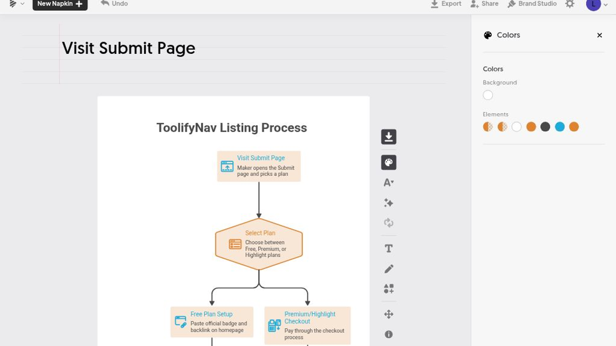
Right logic, sloppy routing. The retry loop drops under "Listing Goes Live", runs all the way up the right edge of the canvas, and crosses the main line down to Monday Scan on the way. The payment arrow and the Yes arrow merge into one entry. You can read it, but I wouldn't put it on the Submit page untouched.
So I started editing, and the first edit went somewhere else. I tried to change the top node from "Submit Page" to "Visit Submit Page" and the text landed in the document title above the canvas. The napkin is now called "Visit Submit Page", and every export after that downloaded as "Visit Submit Page - Visual 1.png". The node itself only changed when I double-clicked right on its text, which opens an inline editor with a tiny toolbar (Roboto, 12, B, a color picker). The box widened to fit and nothing overflowed.
Color is where I lost the most time. I wanted one box orange. The Colors panel doesn't do one box; it has Background and a row of Elements swatches, and each swatch is a role, so every process box went orange and cream at once. Somewhere in that, one swatch ended up white, and that role also drives the connector labels and outlines. Nothing in the panel tells you which swatch owns what. Some of that is on my clicking. The rest is on a default transparent background that makes white text vanish without a trace.
Swap Layout was greyed out on this flowchart. The Effects panel has styles like Ink Print, Blueprint Review, Sticky Notes and Origami, each behind an "Apply 100" button, which is 100 credits, so I left them alone. Undo worked every time I needed it.
Export sizes, the watermark, and where the credits hide
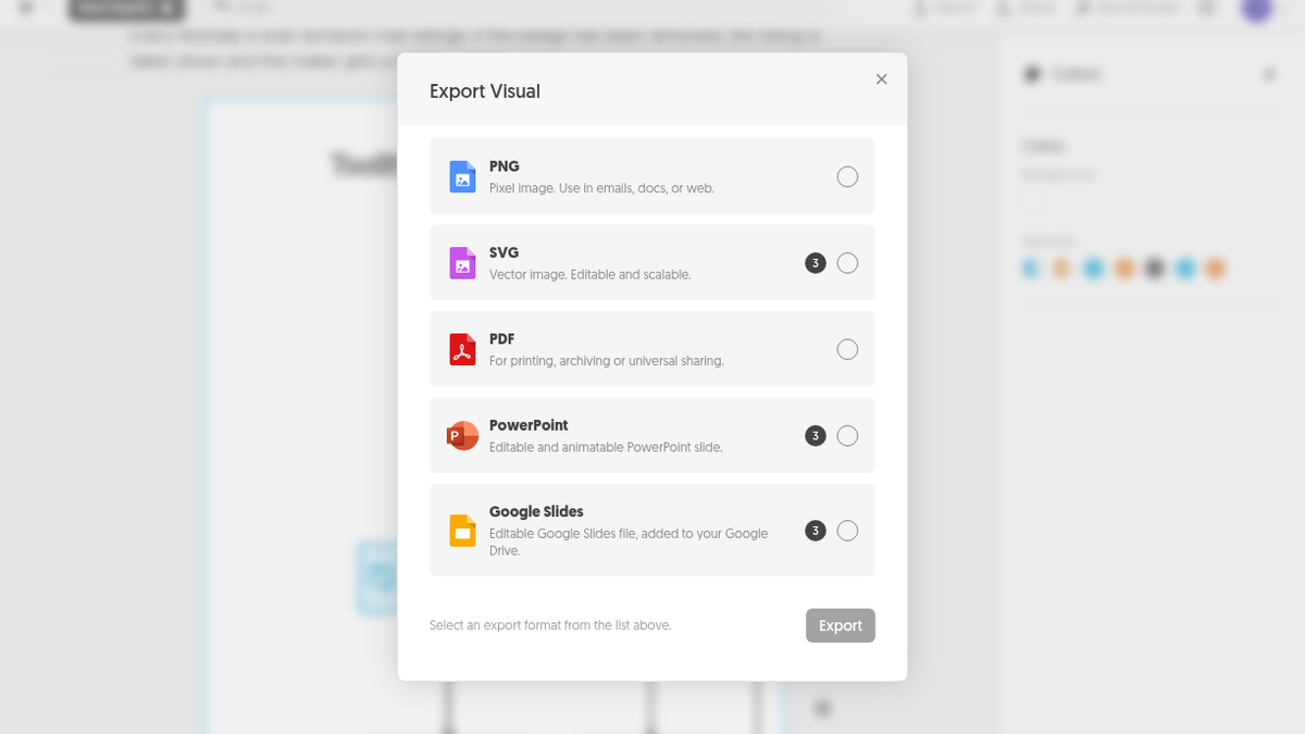
The default 1x PNG came out at 542 × 1665 px, 151,995 bytes. That's too narrow for a blog column, and I almost wrote it off before finding Resolution in the export options. 2x gave me 1084 × 3329 px (375,629 bytes) and 3x 1626 × 4994 px (642,964 bytes), both free. Every PNG carries a small grey "Made with Napkin" in the bottom-right corner, and flipping Napkin Logo to Off gets you "Remove Napkin Logo is a premium feature." PNG and PDF are free; SVG, PowerPoint and Google Slides each show a 3-credit badge in the Export Visual dialog. I didn't try those, or the PDF, or decks, file import, Brand Studio, sharing or the Developer tab.
The second test was 48 words about my week: Monday morning I add 26 tools, Monday to Thursday one review a day, Friday a comparison page, Monday evening a digest of submissions. Four suggestions came back in about 14 seconds (22:27:09 to 22:27:23). Each box in "ToolifyNav Weekly Workflow" had the right sentence, but in the order I typed them, so "Monday Evening" sits under "Friday" like it belongs to the next week. A human would have caught that. Then again, I wrote it in that order.
The editor never shows your balance. I found it in Account Settings, under Subscription: "Weekly Credits, 466 Credits left", refilling October 11, 2026. Two generations cost 34 of the 500. On napkin.ai/pricing, Plus is $9 per person per month billed annually ($12 monthly) with 10,000 credits, SVG and PPT export and no branding; Pro is $22 ($30 monthly) with 30,000 credits, custom branding and font upload.
Before it goes anywhere near my Submit page
If you already write your processes out in prose, for docs, a changelog, or a long X reply, and you want a real flowchart out of that paragraph without opening Figma, this does the hard part. It found my branches and my retry loop on the first try, and the free tier gives you enough credits and a big enough PNG to use the result. Just put the export on the page you're publishing to before you trust it.
If you need to style single boxes, route lines yourself, or ship an image without someone else's logo on it, the free plan will annoy you fast. Pricing and alternatives are on the Napkin AI listing.
Final rating: 4 out of 5.
ToolifyNav Directory
Explore Napkin AI on ToolifyNav
Text-to-visual tool that turns pasted paragraphs into editable diagrams, flowcharts, mind maps and charts for slides and docs.